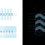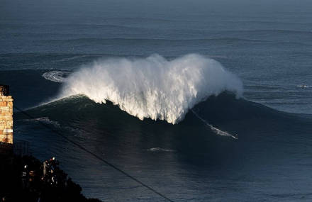


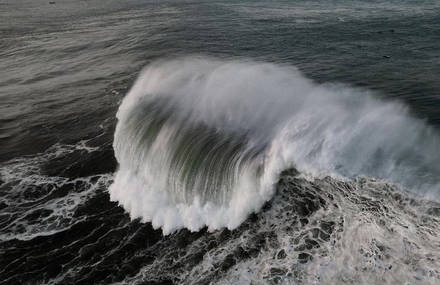


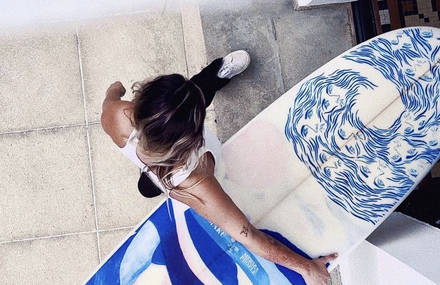


Teahupo’o is a mythic wave on the south-west coast of the island of Tahiti. Surfed by the bests surfers from all over the world, it is well renowned. It was the subject of one of Paolo Agostini’s work, commissioned by an eponymous surf shop with 20 years experience in the Brazilian market. The inspiration came from the surf universe, the sea, and the surf spirit. In this project, Paolo had to give a contemporary, clean, minimalist and current look. For this, he created, with the typography, a strong symbol that translates the universe of surf, and that is easy to apply in any material related to the brand. The decision was to underline the letter « E », « as the main element of the visual identity, consisting of three lines in the form of a series of waves », he explains.


Images Galerie (10)