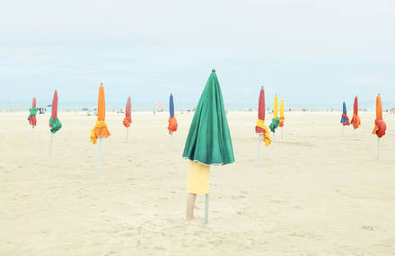
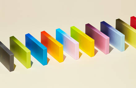


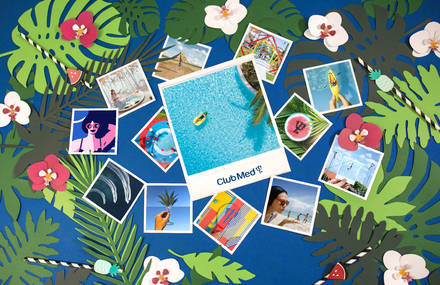

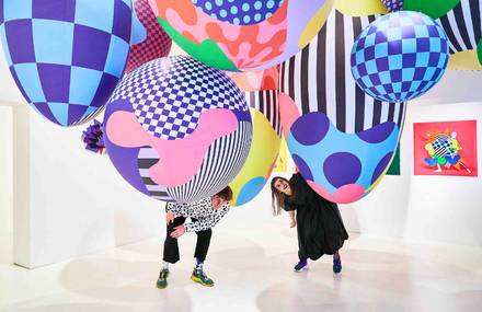
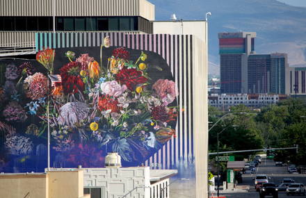
Fubiz and Adobe bring together two worlds to imagine a creation that explores the theme Creative Democracy, one of the visual trends 2019 identified by Adobe. This visual trend is to show bright colors, varied subjects and videos that arouse emotion.
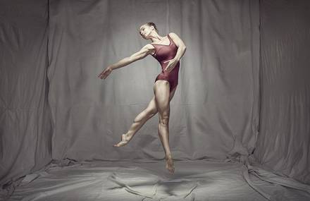
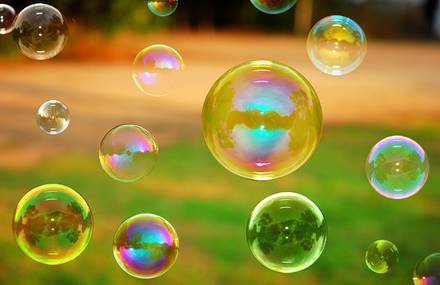
Two new talents collaborated: the Adobe Stock contributor Katya Havok, a photographer with very colorful staging, and the digital artist Mathieu Le Berre, who combined their skills to imagine a duet creation.
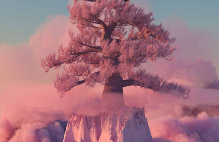
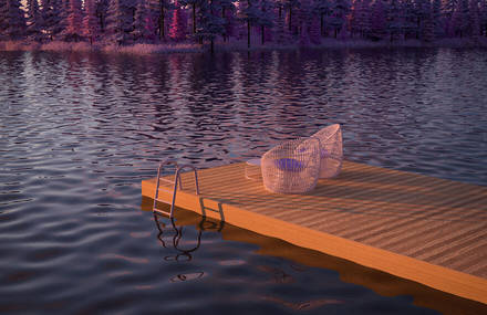
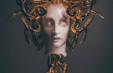
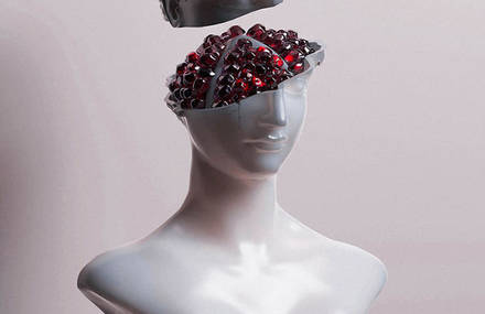
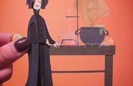
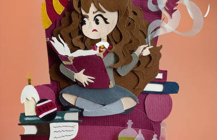
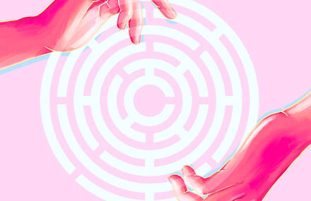
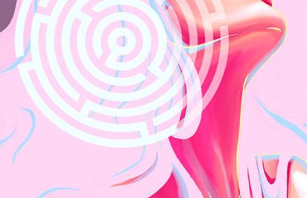
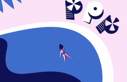
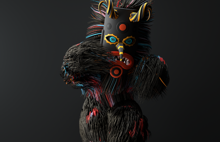
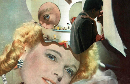
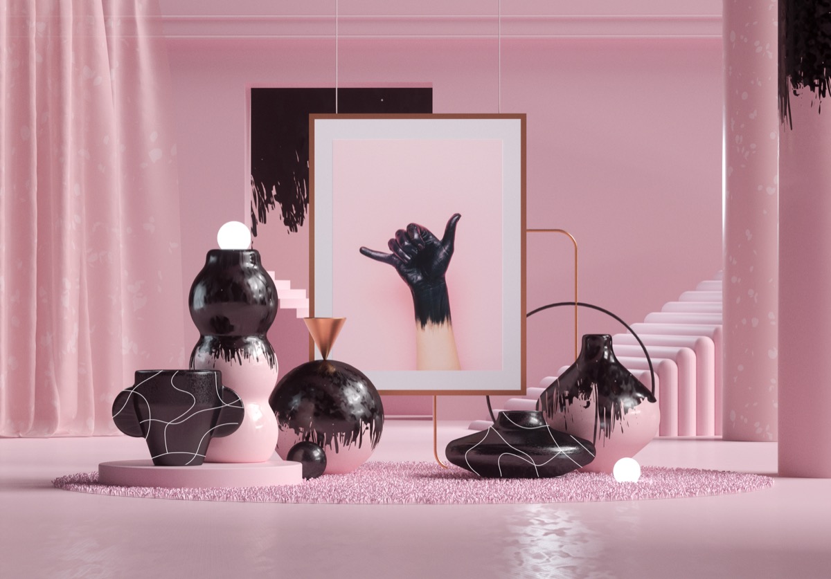
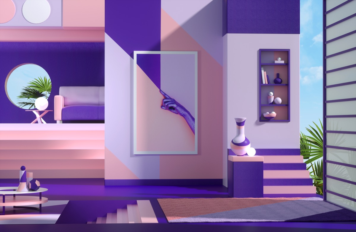
Inspired by three images of Katya Havok, Mathieu Le Berre has designed three digital 3D creations that showcase all the inspiration provided by the images made available by Adobe Stock.
Mathieu Le Berre and Katya Havok took part in the cross-interviewing game to present their creative world and their perspectives on creation in 2019.
Mathieu Le Berre and Katya Havok took part in the cross-interviewing game to present their creative world and their perspectives on creation in 2019.
Can you introduce yourself in a few words and tell us a little more about your creative world?
Mathieu Le Berre: I finished my design studies three years ago and joined Doze Studio, a motion design studio where I learned a lot! They introduced me to 3D and it is in Nantes, France that I started to develop a style between 3D and 2D.
The funny thing is that I feel like I just started and that my creative world is not really installed. As I was inspired, I started to have preferences and build something more personal. I’m just starting freelance and my goal in the next few years is to travel and really create my graphic style!
Katya Havok: Firstly, I would like to introduce my real name: Ekaterina Chebotareva. Katya Havok is an abbreviated form of my first name plus an alias. I consider myself a conceptual photographer and digital artist. I specialise on still life photographs, studio photography and art collages. My images have specific bright colors, creative concepts and also consist of minimalism and surrealism.

Mathieu, your creations are very colorful, have a childish and geometrical spirit. How did this appetite for this universe come to you?
I often tend to want to make graphical structures and build a scene around these elements. In a fun way, this universe came to me naturally, because this kind of childish and geometric visual is much freer than realistic renderings.
I really like colorful palettes and abstract shapes. Photoshop and Illustrator also offer a lot of tools to simplify shapes. The link between 3D and these two software makes the abstract even more interesting and allows me to express myself freely.
Your creations are very colorful and you have a very minimalist spirit. How did this appetence for this universe come to you?
My passion for pop colors and minimalist culture came to me about ten years ago, when I was at university where I was able to study the history of contemporary art. Among other things, I was very inspired by the works of Roy Fox Lichtenstein, Jackson Pollock and Salvador Dali. In addition, minimalism was for me like a breath of fresh air. After a while, I started to create my own style, combining minimalism, surrealism and pop art, in a truly unique form.
Can you tell us a little about the creative process of your beautiful creations?
Mathieu: In general, something strikes me. A photo I took or the last creation of an artist that motivates me to create!
I start with a sketchy simple sketch that I copy almost identically. The rest is quite natural, I start the bases between structures, light and colors.
I love to switch from software to software, it’s really convenient to see the evolution of its image and to take a step back.
Katya: My creative process starts in the morning with a cup of coffee and petting my cat, which is often in my photos. I like to work with loud music, especially hard rock. It adds confidence and courage to my photos. Also, I love to paint hands. Usually, my model is either my husband or myself. In the second case, I use a tripod and a remote to take a picture. I use bold bright colored backgrounds. I can work only when I am overwhelmed with emotions and feelings, when there is inspiration.
The creative Mathieu Le Berre chose to use 3 of your creations present on Adobe Stock to imagine very pop and geometric 3D design. What do you think about creations using pop colors? And what those colors give to the creations?
I love pop and geometric design in art. It reflects the spirit of generation and modernity in general. Pop colors give a very clean shade and representation of the object, express its naturalness and harmony in an ideal space. Such colors give creations the purity of realization of forms, ideal geometric proportions, cutting off all unnecessary.
In my opinion, the work of Mathieu Le Berre is a great example of collaboration between two representatives of different types of creativity, combining various shapes and colors into a single work of art.
Mathieu, for this work you have collaborated with Katya Havok who imagines digital and photographic staging very colorful and pop. What do you think the use of this type of color to a creation?
What’s really cool with artists like Katya Havok is that the color palette is very natural. She is rather amazing and very assertive!
For my part, I really tend to lose myself in color and spend time looking for the right palette, but precisely, with Katya compositions are direct and impacting. This immediately gives the tone to the image and allows to project quickly.
Adobe has selected in the trends of the year 2019, the theme of creative democracy and the use of pop colors in the creation.
Do you think that the presence of pop colors in a creation causes the observer of the latter?
Mathieu: As I said, I tend to lose myself with colors. Try to have the most original palette? Have a pop or minimalist image? A lot of questions. Adobe has raised an interesting theme, and I notice for several years in the design a change of style, more original. We try to mark the spirit and win.
I think that if a creation causes a feeling of unexpectedness and marks the spirit, the color is for a lot and allows to give a tone to the visual.
Moreover, we recognize some artists thanks to the palette used. And often, pop colors are present!
Katya: I believe that pop colors are not only democratic and show freedom of choice, but they also illustrate the courage of the creator, his challenge to the world and public opinion. For me, using of pop colors is a symbol of my human freedom, fortitude and self-expression.
If you could summarize your work in one sentence, what would it be?
Mathieu: The less sense there is, the more I find myself there.
Katya: It would be like this: a battle of brevity and impudence under the rays of bright colors.
In the coming days, we will propose on Facebook to select your five favorite images from the Adobe Stock collection on this theme of pop colors in the creation.