


From the iconic companies Budweiser or Kodak to the most recent ones such as Instagram or Uber, all of them have a strong visual identity. In 2016, many of them nevertheless decided to refresh their logos. More uncluttered, with a new typography, new colors or on the contrary not so far from their original symbol, here is the selection of the most successful by Fubiz.
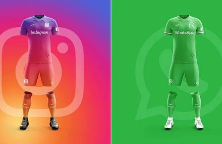
1.Instagram
The famous camera of Instagram experienced a strong rejuvenation: a more suggestive and minimalist but also more colorful version. A reference to the numerous filters that the app offers.

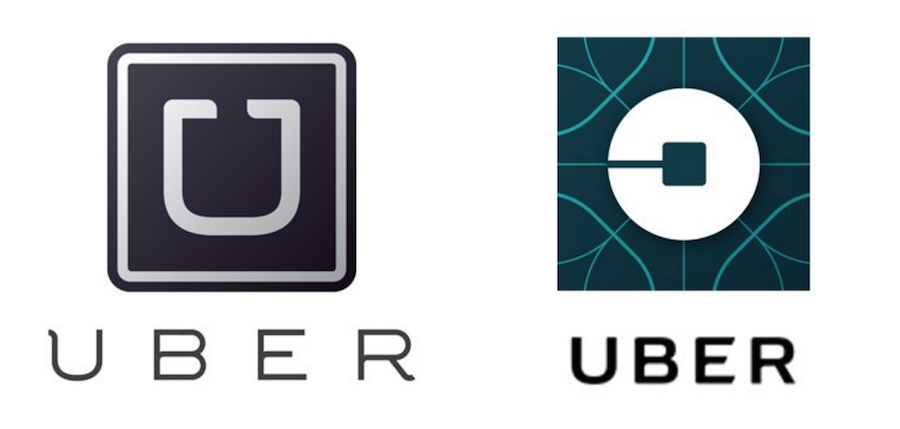
2. Uber
Even though the symbols are not that different, the change of logo of Uber came along with the launch of a new service : Uber Rush, wich is only available in Chicago, San Francisco and New York for now.
3. Netflix
Made of a ribbon, the new “N” of Netflix fits with a trend that consists in creating “folded” logos ; like optical illusions that give depth.

4. Mastercard
The emblematic red and orange circles were conserved but the “c” of “card” is now written in lowercase to mean, according to the CEO of the brand, Raja Rajamannar, that a Mastercard is way more than a simple credit card.

5. The MET
Although it is controversed, this change is however truly emblematic. The museum didn’t have a proper strong visual identity and when its new typography was revealed, it was said that it was copied on the one of a magazine ; many people then wished the return of the previous one.

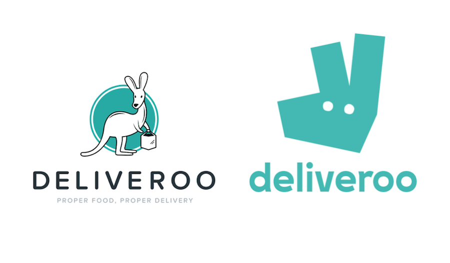
6. Deliveroo
In 4 years of existence, the Deliveroo team quickly evolved. In order to go along with this progression, a new visual aspect was designed, followed by HD pictures of the different meals on the website as well as a reflective uniform for their delivery employees.
7. Kodak
As it is unavoidable, the giant of photography keeps and highlights its red and yellow colors – that sometimes remember the ones of Mastercard. The brand even makes a step backwards with its huge “K”.

8. Mozilla
For its new visual identity, Mozilla called on the graphic designer Johnson Banks but also its users who could follow the creative process and give their opinion on the topic.
![]()
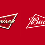
9. Budweiser
The famous American beer Budweiser was created in 1876. 140 years later, as Anheuser-Busch thought this 2016 was a particularly American year, the logo experiences an important purification but keeps its recognizable bow tie shape as well as its red color.

10. Pitchfork
Even if it stays close to the original logo, Pitchfork decided to separate from its previous type but also from the arrows of the Triton that designed the outlines of the final “k”.

Images Galerie (11)