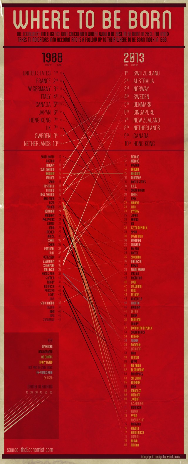































































From infographic agency WOND, the infographic compares the 1988 and 2013 ‘Where To Be Born’ study from EIU. The study weighs up many different factors from life expectancy to political freedoms to give you a pop style chart going from best to worst. Interestingly the results have changed significantly from 1988 and where this infographic gives you an easy to read comparison of which countries have been promoted and which have been demoted. See the full size infographic design here.