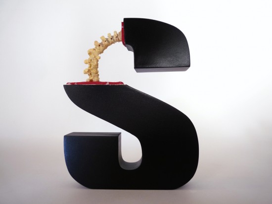
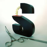
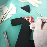
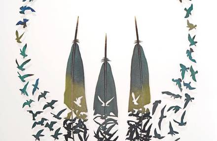
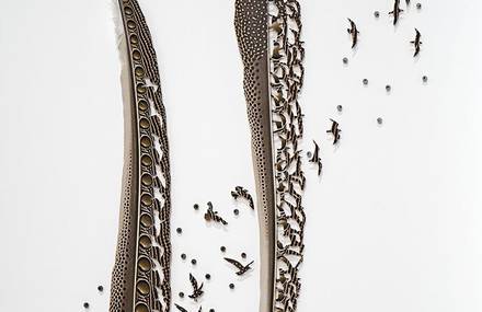
Une superbe série par le créatif autrichien Andreas Scheiger autour de la naissance et l’évolution de l’alphabet. Une ouverture chirurgicale des lettres A, Z, S et W en faisant apparaître des muscles, des veines et des os comme de véritables êtres vivants. Plus d’images dans la suite.
Articles Similaires
- •
- •
- •
14 commentaires
Ajouter le votre ?demosthene : tout pareil
http://www.evasion.cc/blog/comments/anatomy-letter-grafik-tasarim/
I don’t understand the « computer graphics » of common computer typefaces.
When one « blows-up » an image like a photo or drawing, one can see the individual pixles of the image. It’s especially apparent along curved or sloping edges of items in the image. That’s true in programs involving, e.g., photos and photos of drawings.
But not with computer type! No matter how much you magnify a computer letter– H, S, Z, or 1, 4, 8 — their edges seem smooth and clean. Whether the letter’s forms are vertical, slanted or curved, you never see a letter’s uneven edges caused by « pixilation. »
My experiment involved MS Word letters enlarged on my screen to « point size » well over 1000. Maybe I just need a new, high-res computer screen?
Is that letter on a computer screen still an « image » similar to a drawing? If not, what is it?


i wish they had done more with this good idea.