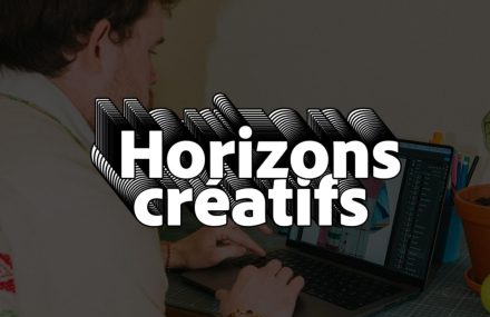


The design of the logotype is started with the analysis of the most established 100 fonts in the international landscape. From the overlap of the first 15 it has become apparent the common denominator of the new typography.
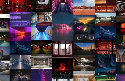
We design a grid which allow to characterize in a personal way the artifacts within a space defined by geometrical rules, allowing everyone to personalize the promotional material of the SPD.


![]()