Alan Woo
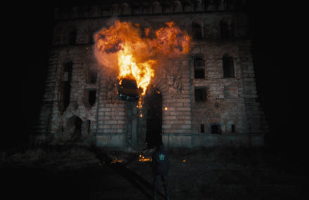
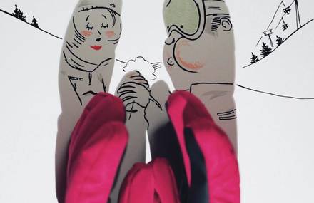
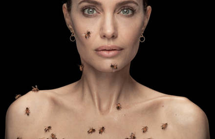
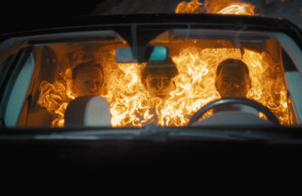
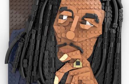
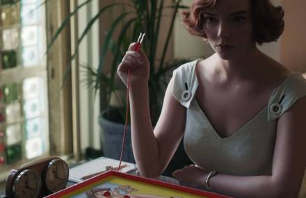
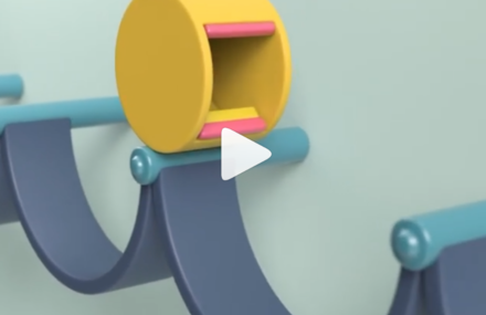
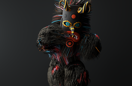
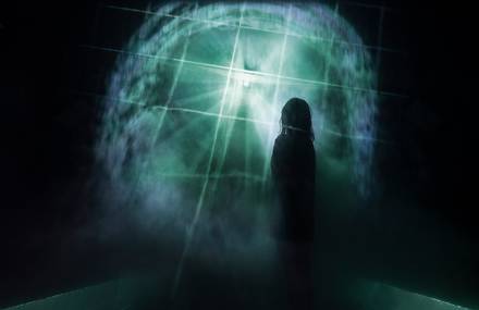
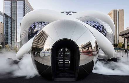
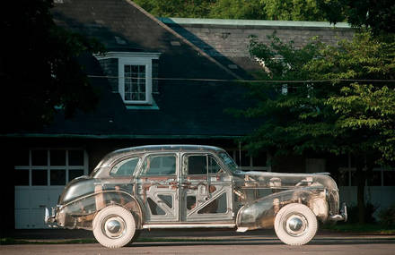
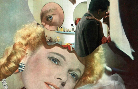
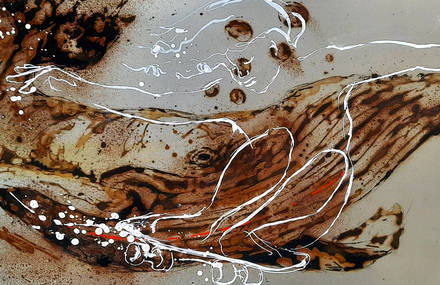
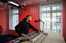
Un exemple parlant des travaux décalés et très intéressants de ce canadien, spécialiste dans l’art numérique. Etudiant en 4ème année à l’institut de Vancouver, il travaille essentiellement sur les explorations visuelles dans le réel.


Plus d’informations sur sa page.
Tweet


ahahah oh yes, you HAD to show your trendy iphone casually positionned on your desk…..you MUSt be a good designer then….
Des magnifiques images et un super sens de la mise en scène!
Il dit qu’il ne comprend pas véritablement la chose. Voir même qu’il trouve ça assez moyen.
Aussi bien au niveau de l’intérêt qu’au niveau de la mise en scène que je trouve quelque peu inexistante (le rapport entre les objets intégrés et la photo avec l’avion qui décolle en fond ?)
Là je… non, j’adhère pas.
Faut le voir plutôt comme une sorte d’expérimentation, sans forcément un sens profond derrière :)
La première image est en tout cas très réussie!
ok ….mais pourquoi cette nouvelle mode des formes et volumes geometriques decoupes dans du papier fluo ou pale? Quel en est le sens? en quoi est ce approprie? pourquoi soudainement on retourve ca dans le travail de tout les designers? (une reduction sur un vieux stock de papier couleur peut etre?…)experimentation oui…mais elle n est pas obligee d etre denuee de tout sens. le design est une recherche esthetique ….accompagne d un sens .
Hello!
First of all, thank you for linking to me. I was just notified of this by a friend abiabiabi.com.
From my poor French, I can understand there is some confusion as to the intent behind my current work. First of all, these are primarily aesthetic experiments towards understanding my thesis more. I am inspired by late-eighties/ early-nineties computer-driven aesthetics that almost seemed to define a generation of design or visual arts (in a particular field at least). With culture being an almost persistent state of reversal and borrowing, the idea of postdigital looks at yet another reversal as we retreat to analog or ‘more human’ foundations or once again. This is heavily and most overtly represented through say hand-lettering/typography or the film-making of Michel Gondry’s paper sequences or use of legacy techniques for special effects etc. In the times before the computer and desktop publishing arrived, paste-up acted as a refined process for layout and composition – the ‘hand-made’ was no longer obvious, but still present. When desktop publishing and early 3d rendering arrived, a generation of new visual forms emerged – a digital age began to create and define numerous digital memes.
So, in contrast to the many things that fight back against the computer-driven, I wanted to recreate this language in analog forms but make it transparent – I wanted it to look digital, and to be honest, these sketches are indeed very much so. Alas, it is something I am working towards. In essence, I wanted to aim for the balance between oscillating extremes: not purely digital nor purely analog but both.
I have been confronted a fair bit by my professor regarding my reasoning and purposes for this project. I am looking at this project as my last piece as a student, and I want to enjoy myself, I think that pretty much sums it up. It is an experiment, and it is an aesthetic one. I think the important thing is to take it for what it is: pretty, fun, pretty fun. (I think I just found the title for it…)
I hope that clarifies some things, in writing it helped me understand it myself a little more.
Yes, the iPhone, that is embarrassing, but I was listening to music while cutting out those little squares and didn’t think to remove it when snapping the occasional process photo. What can I say, I am a nerd all the same.
C’est peut être pour cela qu’il s’agit "d’art numérique" et non de graphic design john.
et ceux qui critiquent, ils ont des trucs à montrer?
Pour moi il y des choses qui sont agréables à regarder et c’est tout.
Les explications souvent me saoulent!!!!
"art digital et numérique", c’est légèrement un pléonasme…
hey alan!
well, i’m very impressed by the first picture, think it really has an univers, because we (born in the 80’s) are so attached to all those new technologies that was blooming up. And yes it is in the same wave as Michel Gondry ( btw did you see be kind rewind ?) but the last picture is more like a constructivist painting.
good luck for your assignement, hugs ;)
Hi Alan.
Thanks to your iPhone, there’s something new in those pictures (I’m mean but I was pretty proud of it, sorry). Really, do you know Happypets? They are graphic designers from Switzerland. They did the very same thing in 2002, and Apple have cursors sculptures in their parc in Cupertino since the 90’s. Maybe I miss something.
Hi Juliette!
Every Juliette I know is beautiful and I think you are. I also think I heard Rodtchenko screaming from his grave when you said "constructivist". But Gondry would agree. In his former movies, he used his ideas to tell a story. Now, unfortunately, he’s doing movies ABOUT his ideas. Did you like it? I adored "Eternal Sunshine of the Spotless Mind". (You see, I like things too.)
Hello! Thanks for your comments another john. Happypets are an incredibly talented group but their work with digital icons was digital in digital files. In a similar vein, Apple’s, now removed, icon garden was at the onset of this digital revolution; many things have changed in the past twenty years in terms of context. Finally, these are sketches/process.
Do you have a website/email? I’d love to talk about this some more.
Thanks again,
Alan
Sent from my iPhone.
empty frame with broken link is brilliant!
I know right… You totally can’t be a designer unless you have an iPhone and work on a Mac. (Spare me 9_9)