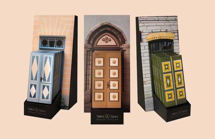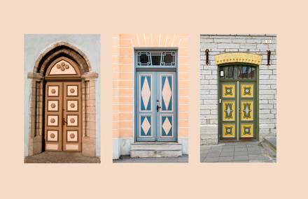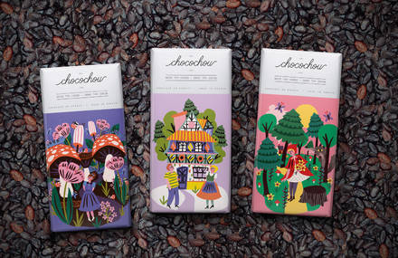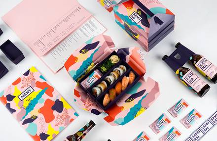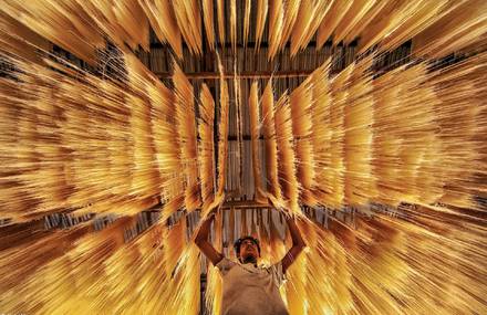


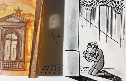
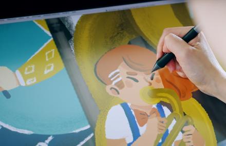


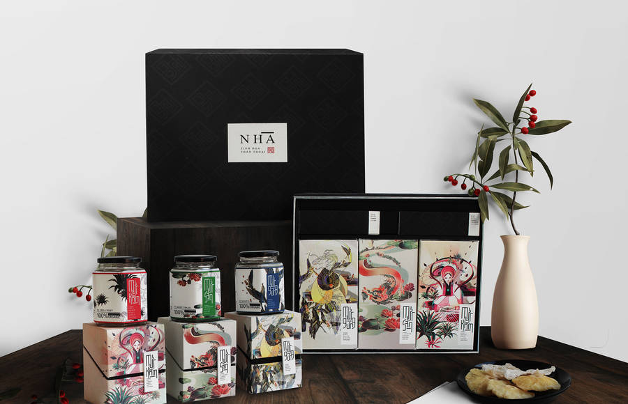
Les jolies illustrations d’Anh Nghiet Nguyen ornent l’emballage de Nhà...
35
Custom your daily dose of inspiration
Access to exclusive content and new products before everyone else
Add to favorites your articles on Fubiz
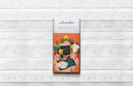
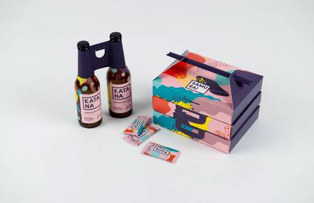
Les jolies illustrations d’Anh Nghiet Nguyen ornent l’emballage de Nhà...
35