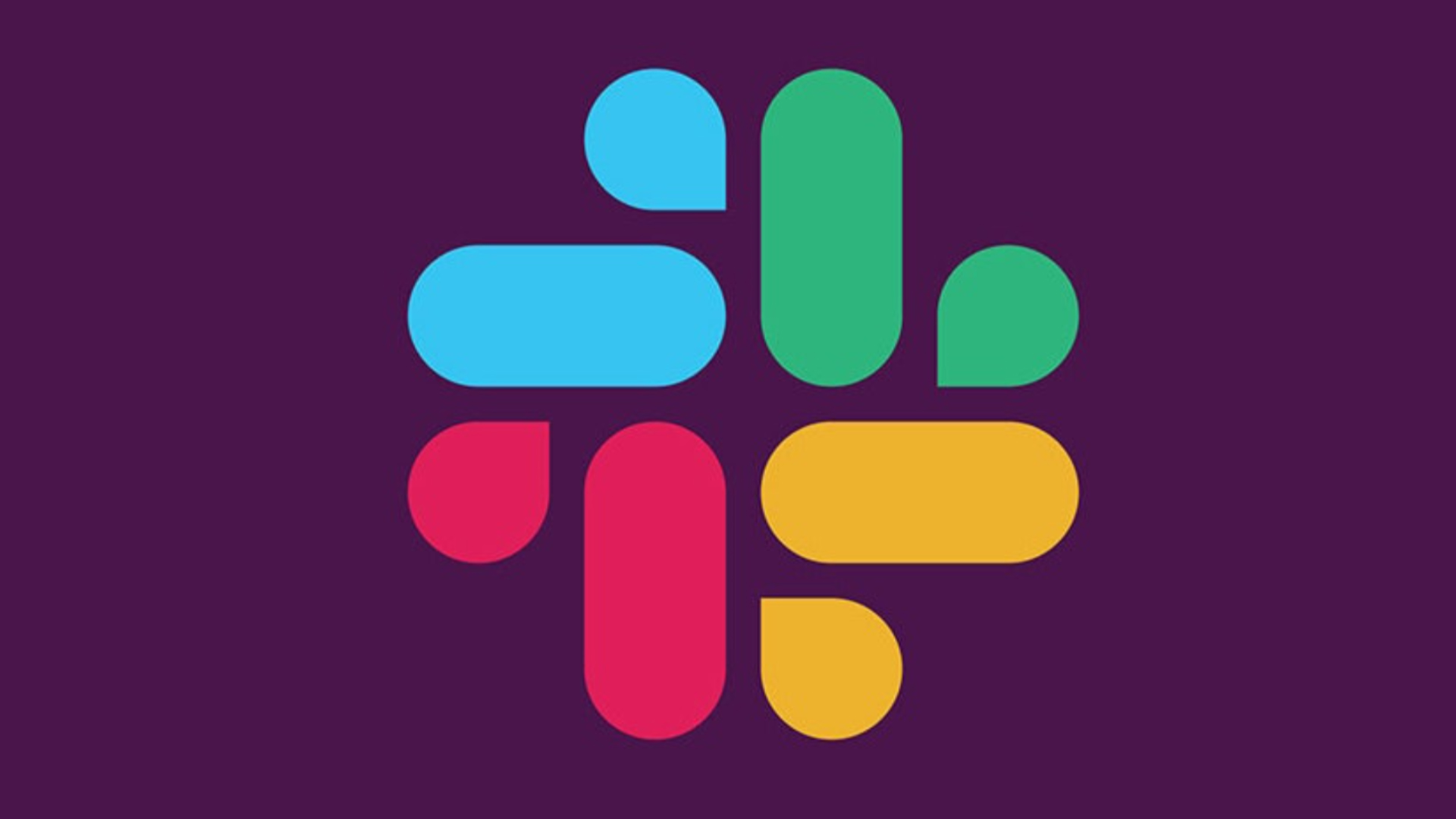


Since its creation, the international firm with millions of users has experienced dazzling growth and notoriety. It was therefore time to redefine the logo to better represent the spirit and identity of the company. In fact, the old logo, a multicolored hashtag, had become slightly problematic. First because it was difficult to reproduce, because of the 11 colors that made it up, but especially because without these colors, there was only one hashtag left that was not specifically related to Slack’s identity. It was therefore the Pentagram design studio that was commissioned to redesign this logo, accompanying and concluding the dazzling rise of the desktop application.

![]()